
“What is your first impression when you see the bright red Coca-Cola logo?”
“Or why do you think white and blue are commonly used in hospitals?”
In the field of multimedia, visual appearance is crucial. In design world, color selection significantly impacts the final outcome of a work, as color is not merely decoration but also a powerful communication tool.
Research indicates that each color carries different meanings, connotations, and psychological effects. Therefore, mistakes in color selection can result in an unappealing and ineffective presentation of the message. Rather than creating a harmonious design, it can end up being ironic.
Choosing colors is a critical task that designers must master, especially when it comes to understanding color psychology.

So, what is color psychology?
Color psychology is the study of how colors influence human behavior, mood, and perspective.
The ability of color to affect various aspects makes the process of selecting colors in design more complex than it may initially seem.
In the realms of design and marketing, the right color choice has impacts that extend beyond aesthetics, as colors can influence consumer emotions and behaviors.
Interestingly, research shows that 85% of people choose a specific product because they are motivated by its color, and 92% acknowledge that visual appearance is the most persuasive marketing factor.
In psychology, color is not merely a visual element; it is also a symbol rich with meaning. Studies have shown that certain colors can evoke both positive and negative emotion in individuals.
The concept that colors have both positive and negative sides is an intriguing and fairly subjective viewpoint.
“So, are there specific principles for choosing colors for a design?”
There isn’t a strict scientific definition that categorically divides colors into two such categories. However, psychologically and culturally, we often associate colors with specific emotions and meanings.
Here’s a brief overview of color meanings and examples:
1. Red

- Positive aspect: Often associated with courage, energy, joy, and passion. It is very attention-grabbing and frequently used as a warning sign.
- Negative aspect: Excessive red can evoke feelings of aggression or restlessness.
- Example: Nike’s red logo symbolizes fighting spirit, bravery, and victory.
2. Blue

- Positive aspect: Commonly associated with calmness, trust, and stability.
- Negative aspect: Can appear cold and unfriendly, and in some cultures, is associated with sadness.
- Example: Blue is widely used in banking apps to convey trustworthiness and stability.
3. Yellow

- Positive aspect: Conveys optimism, intelligence, happiness, creativity, and increases energy.
- Negative aspect: Dominance of yellow can lead to feelings of frustration and anxiety.
- Example: Yellow in the Nickelodeon logo creates a cheerful, fun, and happy impression.
4. Green

- Positive aspect: Represents nature, freshness, growth, calmness, balance, and harmony.
- Negative aspect: Can signify stagnation, ignorance, and conservatism.
- Example: Many companies use green to convey a natural and eco-friendly image.
5. White

- Positive aspect: Represents purity, cleanliness, simplicity, and spaciousness.
- Negative aspect: Can feel cold, sterile, and boring.
- Example: White is commonly used in hospitals as it conveys cleanliness and sterility.
6. Black

- Positive aspect: Often associated with power, elegance, mystery, luxury, and formality.
- Negative aspect: Can symbolize depression and gloom, making spaces feel smaller.
- Example: Black clothing is often worn for formal events to convey elegance.
This guide isn’t absolute, as numerous factors influence color perception, such as culture, personal experiences, and context.
For instance, in Western cultures, black is often associated with mourning, while in some Asian cultures, white carries the same meaning.
Here are some tips to consider before choosing colors:
1. Understand the design’s purpose and target audience.
Color preferences differ among people based on gender and age. For example, vibrant colors are often used in children’s books to evoke cheerfulness, while softer colors like pink are frequently found in applications targeting women.
2. Conduct research on the local culture.
Each culture has different color perceptions. For instance, red in Chinese culture symbolizes luck, prosperity, and happiness, whereas in Indian culture, red is often associated with bravery, strength, and passion.
Understanding cultural context is vital, especially if the product is aimed at a global market. Choosing colors that resonate with the target audience’s culture can create a stronger connection.
3. Identify the primary color representing the brand.
Choose a main color that embodies the brand. Use tools like Adobe Color or Coolors to discover harmonious color combinations.
4. Research current design trends.
Design trends are always evolving, and color palettes change accordingly. However, don’t get too caught up in trends; the most important thing is to choose colors that align with the brand’s identity and target audience.
Platforms like Dribbble or Behance can serve as great references.
5. Test the design across various devices and lighting conditions to ensure color consistency.
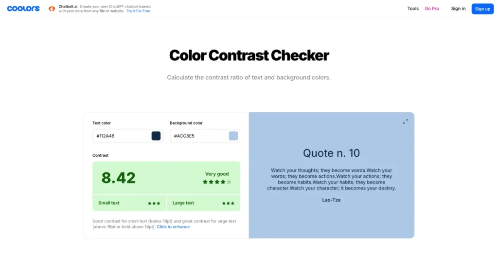
Tools like the Color Contrast Checker can help assess color contrast levels. Using these tools to ensure design accessibility, where 1 out of 5 people have some form of disability, including vision problems that make color contrast very important.
Behind every color choice lies a profound reasoning and strategy. By understanding color psychology and user context, we can create designs that are not only visually appealing but also effective in communicating messages and achieving business objectives.
So, don’t hesitate to continue learning and experimenting with different color combinations!
That concludes our discussion on color selection in design and some helpful tips. Happy creating!
